The border-bottom-left-radius CSS property rounds the bottom-left corner of an element by specifying the radius (or the radius of the semi-major and semi-minor axes) of the ellipse defining the curvature of the corner.
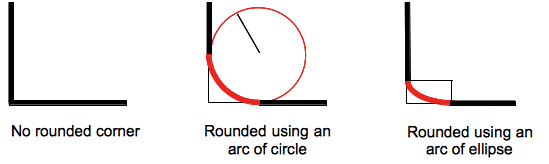
The rounding can be a circle or an ellipse, or if one of the value is 0 no rounding is done and the corner is square.
A background, being an image or a color, is clipped at the border, even a rounded one; the exact location of the clipping is defined by the value of the background-clip property.
Note: If the value of this property is not set in a border-radius shorthand property that is applied to the element after the border-bottom-left-radius CSS property, the value of this property is then reset to its initial value by the shorthand property.
Syntax
/* the corner is a circle */
/* border-bottom-left-radius: radius */
border-bottom-left-radius: 3px;

/* Percentage values */

/* circle if box is a square or ellipse if box is a rectangle */
border-bottom-left-radius: 20%;

/* same as above: 20% of horizontal(width) and vertical(height) */
border-bottom-left-radius: 20% 20%;

/* 20% of horizontal(width) and 10% of vertical(height) */
border-bottom-left-radius: 20% 10%;

/* the corner is an ellipse */
/* border-bottom-left-radius: horizontal vertical */
border-bottom-left-radius: 0.5em 1em;

/* Global values */
border-bottom-left-radius: inherit;
border-bottom-left-radius: initial;
border-bottom-left-radius: revert;
border-bottom-left-radius: revert-layer;
border-bottom-left-radius: unset;
With one value:
- the value is a
<length>or a<percentage>denoting the radius of the circle to use for the border in that corner.
With two values:
- the first value is a
<length>or a<percentage>denoting the horizontal semi-major axis of the ellipse to use for the border in that corner. - the second value is a
<length>or a<percentage>denoting the vertical semi-major axis of the ellipse to use for the border in that corner.
Values
<length-percentage>-
Denotes the size of the circle radius or the semi-major and semi-minor axes of the ellipse. As absolute length it can be expressed in any unit allowed by the CSS
<length>data type. Percentages for the horizontal axis refer to the width of the box, percentages for the vertical axis refer to the height of the box. Negative values are invalid.
Formal definition
| Initial value | 0 |
|---|---|
| Applies to | all elements (but see prose) |
| Inherited | no |
| Computed value | pair of computed <length-percentage> values |
| Animation type | by computed value |
Formal syntax
<length-percentage [0,∞]>{1,2}Examples
Arc of a circle
A single <length> value produces an arc of a circle.
div {
  border-bottom-left-radius: 40px;
  background-color: lightgreen;
  border: solid 1px black;
  width: 100px;
  height: 100px;
}
Arc of an ellipse
Two different <length> values produce an arc of an ellipse.
div {
  border-bottom-left-radius: 40px 20px;
  background-color: lightgreen;
  border: solid 1px black;
  width: 100px;
  height: 100px;
}
Square element with percentage radius
A square element with a single <percentage> value produces an arc of a circle.
div {
  border-bottom-left-radius: 40%;
  background-color: lightgreen;
  border: solid 1px black;
  width: 100px;
  height: 100px;
}
Non-square element with percentage radius
A non-square element with a single <percentage> value produces an arc of an ellipse.
div {
  border-bottom-left-radius: 40%;
  background-color: lightgreen;
  border: solid 1px black;
  width: 200px;
  height: 100px;
}
See also
border-radiusshorthand propertyborder-top-right-radius,border-bottom-right-radius, andborder-top-left-radius