The flex-basis CSS property sets the initial main size of a flex item. It sets the size of the content box unless otherwise set with box-sizing.
In this example, the flex-grow and flex-shrink properties are both set to 1 on all three items, indicating that the flex item can grow and shrink from the initial flex-basis.
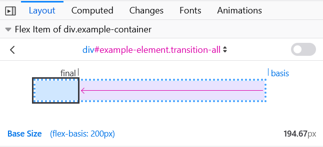
The demo then changes the flex-basis on the first item. It will then grow and shrink from that flex-basis. This means that, for example, when the flex-basis of the first item is 200px, it will start out at 200px but then shrink to fit the space available with the other items being at least min-content sized.
The image below shows how the Firefox Flexbox Inspector helps you understand the size items become:

Note: In case both flex-basis (other than auto) and width (or height in case of flex-direction: column) are set for an element, flex-basis has priority.
Syntax
/* Specify <'width'> */
flex-basis: 10em;
flex-basis: 3px;
flex-basis: 50%;
flex-basis: auto;

/* Intrinsic sizing keywords */
flex-basis: max-content;
flex-basis: min-content;
flex-basis: fit-content;

/* Automatically size based on the flex item's content */
flex-basis: content;

/* Global values */
flex-basis: inherit;
flex-basis: initial;
flex-basis: revert;
flex-basis: revert-layer;
flex-basis: unset;
The flex-basis property is specified as either the keyword content or a <'width'>.
Values
<'width'>-
Any of the following units:
<length>sets an absolute value<percentage>sets a percentage of the width or height of a containing block's content areaautouses the value of the width in horizontal writing mode, and the value of the height in vertical writing mode; when the corresponding value is alsoauto, thecontentvalue is used insteadmax-contentsets the intrinsic preferred widthmin-contentsets the intrinsic minimum widthfit-contentsets the maximum possible size of a containing block's content area, bounded by themin-contentandmax-contentvalues, and calculated based on the content of the current element
content-
Indicates automatic sizing, based on the flex item's content.
Note: This value was not present in the initial release of Flexible Box Layout, and thus some older implementations will not support it. The equivalent effect can be had by using
autotogether with a main size (width or height) ofauto.- Originally,
flex-basis:automeant "look at mywidthorheightproperty". - Then,
flex-basis:autowas changed to mean automatic sizing, and "main-size" was introduced as the "look at mywidthorheightproperty" keyword. It was implemented in Firefox bug 1032922. - Then, that change was reverted in Firefox bug 1093316, so
autoonce again means "look at mywidthorheightproperty"; and a newcontentkeyword is being introduced to trigger automatic sizing. (Firefox bug 1105111 covers adding that keyword).
- Originally,
Formal definition
| Initial value | auto |
|---|---|
| Applies to | flex items |
| Inherited | no |
| Computed value | specified keyword or a computed <length-percentage> value |
| Animation type | by computed value type |
Formal syntax
content | <'width'>
Examples
Setting flex item initial sizes
HTML
<ul class="container">
  <li class="flex flex1">1: flex-basis test</li>
  <li class="flex flex2">2: flex-basis test</li>
  <li class="flex flex3">3: flex-basis test</li>
  <li class="flex flex4">4: flex-basis test</li>
  <li class="flex flex5">5: flex-basis test</li>
</ul>

<ul class="container">
  <li class="flex flex6">6: flex-basis test</li>
</ul>
CSS
.container {
  font-family: arial, sans-serif;
  margin: 0;
  padding: 0;
  list-style-type: none;
  display: flex;
  flex-wrap: wrap;
}

.flex {
  background: #6ab6d8;
  padding: 10px;
  margin-bottom: 50px;
  border: 3px solid #2e86bb;
  color: white;
  font-size: 14px;
  text-align: center;
  position: relative;
}

.flex::after {
  position: absolute;
  z-index: 1;
  left: 0;
  top: 100%;
  margin-top: 10px;
  width: 100%;
  color: #333;
  font-size: 12px;
}

.flex1 {
  flex-basis: auto;
}

.flex1::after {
  content: "auto";
}

.flex2 {
  flex-basis: max-content;
}

.flex2::after {
  content: "max-content";
}

.flex3 {
  flex-basis: min-content;
}

.flex3::after {
  content: "min-content";
}

.flex4 {
  flex-basis: fit-content;
}

.flex4::after {
  content: "fit-content";
}

.flex5 {
  flex-basis: content;
}

.flex5::after {
  content: "content";
}
See also
- CSS Flexbox Guide: Basic Concepts of Flexbox
- CSS Flexbox Guide: Controlling Ratios of flex items along the main axis
width